Browse categories
Explore
Fiverr Pro
English
$
USD


Stop looking at rows of data and start seeing growth. I transform complex datasets into interactive dashboards and narratives that drive business decisions.
What you get:
Why choose me? I don't just deliver a file; I deliver a roadmap. I show you exactly where your money comes from and where your next opportunity lies.
I turn messy Excel data into clean reports and powerful dashboards
Languages
What do I need to provide?
Your raw data (Excel/CSV) and your main business goal.
Can you handle high-volume data?
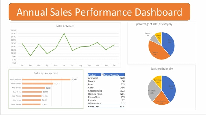
yes, I efficiently process large datasets, such as the 8,325 total units analyzed in my portfolio project
Is the dashboard easy to use?
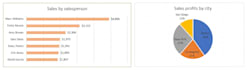
Absolutely. I create intuitive visuals so you can instantly see top performers like Marc Williams ($4,896) without digging through rows of data.
What is "Data Storytelling"?
It’s turning numbers into strategy. I explain why your sales peaked at $2,300 in June and how to scale success to other months.