Browse categories
Explore
Fiverr Pro
English
$
USD


Are you looking to turn raw data into clear, insightful, and professional visualizations?
You're in the right place!
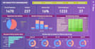
I specialize in data visualization using tools like Excel, Python (Matplotlib, Seaborn, Plotly), and Power BI to help you understand your data better and make informed decisions.
What I offer:
Whether you're a student, business owner, or researcher, Ill help you visualize your data in a meaningful way.
Tools I use:
Excel, Google Sheets, Python (Matplotlib, Seaborn, Plotly), Power BI
Beginner-friendly | Fast delivery | 100% satisfaction
Lets turn your data into decisions. Order now!
Languages
What do I need to provide before you start?
: I’ll need your dataset (preferably in Excel/CSV format), along with a short explanation of what you want to visualize or analyze. If your data needs cleaning, I can help with that too!
What tools do you use for data visualization?
I use Excel, Python (Matplotlib, Seaborn, Plotly), and Power BI, depending on your project requirements and package selected.
Can you clean or organize my messy data?
Yes, basic data cleaning is included in the Standard and Premium packages. For heavily unstructured data, please contact me first for a custom quote.
Will I get the source files of the charts or dashboards?
Absolutely! You’ll receive the original files (Excel, .ipynb, .pbix, or .html) depending on the tool used, so you can reuse or modify them later.
Can I request changes if I don’t like the visualization?
Yes! I offer free revisions based on the package. I want you to be fully satisfied with the result.
