Browse categories
Explore
Fiverr Pro
English
$
USD

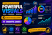


Turn your data into clear, professional charts that are easy to understand and ready to use.
Raw data is difficult to interpret. Good visualization makes it simple and meaningful. I create clean and effective charts that communicate your data clearly.
What you'll get:
I focus on clarity over complexity, your visuals will actually explain the story behind your data.
Tools I use:
Why choose me:
New seller, but highly dedicated to producing quality work and earning long-term clients.
Message me with your data and I'll suggest the best way to visualize it.
Data driven insights using python
Languages
What do you need from me to get started?
Please send your Excel/CSV file along with a short description of your goal and any sample or reference (if available). Clear requirements help me deliver the best work for you.
Do you work with large datasets?
Yes, but please message me first so I can review the file and suggest the best package for fast and accurate delivery.
What if I am not sure which package to choose?
No problem — just send me a message and I will guide you to the right package based on your requirements.


