Browse categories
English
$
USD
Connect to your AI





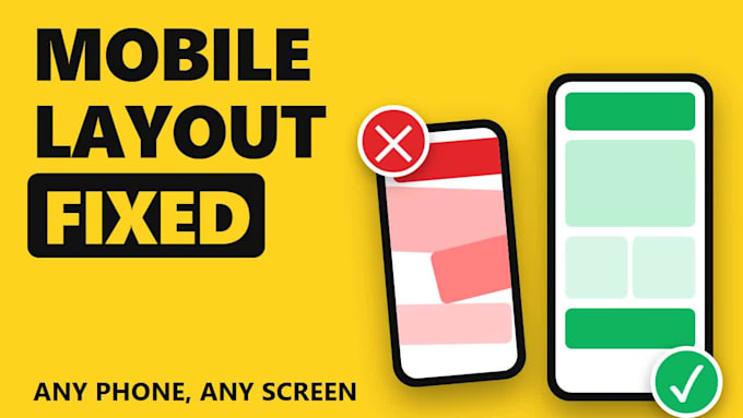
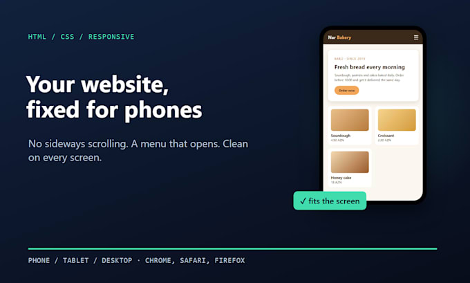
Does your website look fine on a computer but break on a phone? I make HTML, CSS and JavaScript websites responsive, so they look clean on any screen.
Typical problems I fix:
How I work:
I work with plain HTML, CSS, JavaScript and Bootstrap. For WordPress, Shopify, Wix or React, please message me first so I can confirm I can help.
Please be aware that it is against Fiverr's policies for sellers to include themes, templates, or any other elements that infringe third-party rights or applicable laws in the delivered work. Read more about in our Guide to Responsible Digital Creation.
Website and Python Bug Fixes, HTML CSS JavaScript
Languages
Do you need access to my hosting?
Usually not. Send me the code (zip or GitHub) and I return the updated files for you or your developer to upload.
Which devices do you test on?
Common phone widths (360-430px), tablets (768px) and desktop, in Chrome, Safari and Firefox.
What counts as one page?
One HTML page or one template. If several pages share one CSS file, a single fix often helps all of them, and I tell you before you order.
Do you work with WordPress or Shopify?
Mainly plain HTML, CSS and JavaScript. Message me first and I'll tell you honestly if I can help.