I will create publication ready data visualizations and charts in r


About this gig
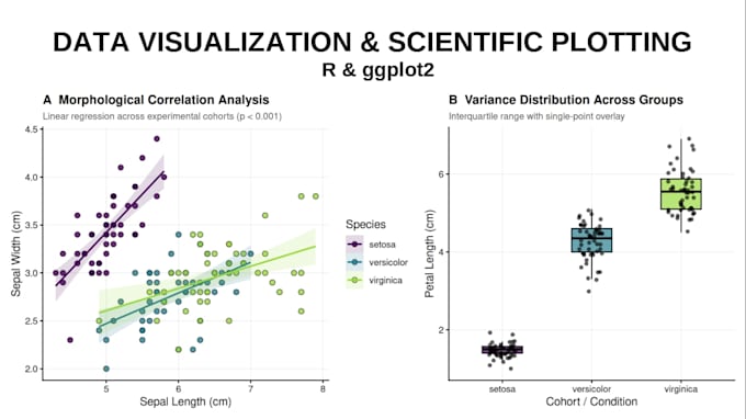
Transform your raw datasets into publication-ready, visually compelling figures. I specialize in statistical data visualization and scientific plotting using R and ggplot2, tailored for academic manuscripts, theses, and reports.
What I Offer:
- Custom Charts: Boxplots, scatter plots, bar charts, heatmaps, histograms, violin plots, and time-series.
- Publication Standards: High-res exports (300/600 DPI in PDF, PNG, TIFF, EPS) matching journal formatting guidelines.
- Advanced Layouts: Multi-panel composite figures (patchwork), custom color palettes (Viridis, ColorBrewer), and facet grids.
- Statistical Annotations: P-values, significance brackets, error bars, and regression curves.
- Reproducible Code: Clean, fully commented R scripts included with every order.
Why Choose Me?
- Technical Rigor: Solid background in quantitative data workflows and reproducibility.
- Fast Communication: Clear updates and precise revisions.
- Strict Confidentiality: Your data remains 100% private.
Please message me before placing an order to discuss your dataset and figure requirements!
Get to know Ariel Valencia
Data Analyst and R Specialist
- FromChile
- Member sinceAug 2026
Languages
English
My Portfolio
FAQ
What formats do you deliver the figures in?
I deliver high-resolution raster and vector formats including PDF, PNG, TIFF, and EPS at 300+ DPI, alongside the fully reproducible R source code.
Can you match specific journal guidelines for figures?
Yes. If you provide the target journal name or author guidelines (font sizes, dimensions, color restrictions), I will format the visuals to match them exactly.