Browse categories
Explore
Fiverr Pro
English
$
USD




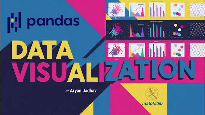
Struggling with messy datasets or unclear trends? I offer a complete service to clean your raw data and transform it into clear, compelling visualizations using Pythons Matplotlib.
What you get:
Tools: Python, Pandas, Matplotlib, Seaborn
Lets turn your raw data into visual insights that speak for themselves.
Aspiring ML Engineer, Python Programmer and Data Science Learner
Languages
What types of files can you work with?
I work with CSV, Excel, JSON, or text-based datasets.
What if I only need visualization, not cleaning?
No problem — I can create visuals from clean data too. Let me know in advance.
Can I request specific chart types or color schemes?
Absolutely — customization is included. Just provide your preferences.
Will I receive the Python code as well?
Yes, if requested — in .ipynb or .py format.
What libraries do you use for visualization?
I use Matplotlib primarily, but can also incorporate Seaborn or Plotly if needed.
Can I see your Projects?
Sure! You can view my projects on GitHub: https://github.com/AryanJadhav15