Browse categories
Explore
Fiverr Pro
English
$
USD





Need a SaaS dashboard that feels clean, trustworthy, and easy to navigate even when the data is messy or complex?
Delivered dashboard UIs for 10+ SaaS and fintech products
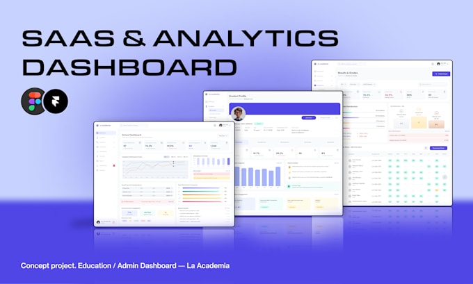
I design dashboard UIs in Figma that turn dense data into something users can scan and act on tables that don't overwhelm, filters that make sense, charts and KPI cards that surface what matters first.
I work on:
How I work:
I use AI tools for early wireframes and placeholder content to move faster, but every design decision is made and refined by hand.
Have an existing dashboard that feels cluttered? I also do redesigns send me a link or screenshots and I'll tell you honestly what I'd change.
Please inform the freelancer of any preferences or concerns regarding the use of AI tools in the completion and/or delivery of your order.
UIUX Designer
Languages
What do you need from me to start?
Project brief, brand assets (logo, colors), content/data examples, and any reference designs. I'll send you a detailed questionnaire after purchase.
Can you work with my existing brand guidelines?
Absolutely! I will adapt the design to match your brand identity perfectly.
Can you sign an NDA?
Yes, I'm happy to sign NDAs for confidential projects.
Can you redesign my existing dashboard instead of starting from scratch?
Yes. Send me what you have, and I'll point out what's working, what isn't, and how I'd improve clarity and usability.
Do you design tables, filters, and data-heavy layouts, not just pretty screens?
Yes. That's most of what dashboard work actually is. I focus on making dense data scannable: clear table hierarchy, sensible filter placement, and charts/KPI cards that surface what matters without clutter.
What's the difference between Standard and Premium?
Premium adds full responsiveness (mobile/tablet), a complete component library, and dev handoff documentation. Built for production-ready apps, not just concepts.
Can you make revisions if I want changes?
Of course! Each package includes a set number of free revisions to ensure the final result is exactly what you envision.