Browse categories
Explore
Fiverr Pro
English
$
USD

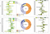
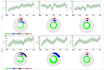
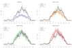
Do you have complex spatial or environmental data that needs to be communicated clearly?
I specialize in transforming raw data into meaningful, visually engaging graphs that tell a compelling story, ideal for research, reports, or presentations.
What You'll Get
Time series plots (e.g., NDVI trends, temperature variation, land cover change)
Comparative bar/line graphs for multiple years or regions
Customized legends, labels, and formatting
Publication-ready graphs in PNG, SVG, PDF, or Excel
Option to include summary statistics
Tools I Use
Python (matplotlib, seaborn, plotly)
Excel
Google Earth Engine
R (ggplot2)
QGIS & ArcGIS (for spatially linked charts)
Turning Earth observation data into powerful insights
Languages


