Browse categories
Explore
Fiverr Pro
English
$
USD


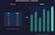
Numbers alone don't tell a story a good chart does.
I'm a Data Science student with hands-on Python experience (Matplotlib, Pandas), and I turn raw spreadsheet data into clear, professional visualizations that actually communicate something.
What I offer:
- Bar, line, and pie charts from your Excel/CSV data
- Multiple chart types to compare, show trends, or highlight distributions
- Clean, readable design with proper labels and titles
- A short written summary of key insights (Premium)
I'm detail-oriented, fast to respond, and I make sure every chart is easy to understand at a glance. Send me your data and let's make it visual.
Python Developer ,Data Cleaning and Automation
Languages
What file formats do you accept for the data?
I accept .csv, .xlsx, and .xls files. If your data is in another format, just message me first.
Can I request a specific chart style or color scheme?
Yes, just let me know your preferences (colors, style, branding) and I'll adapt the charts accordingly.
Do you deliver the charts as images or as editable files?
I deliver high-quality PNG images by default. If you need editable files (e.g. the Python code), just let me know.
