Browse categories
Explore
Fiverr Pro
English
$
USD


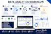
I will transform your raw data into clear, meaningful, and professional visualizations that help you understand your business insights.
I provide data analysis, dashboard creation, and interactive visual reports using Python, Tableau, Power BI, and Excel. I can create charts, graphs, dashboards, and analytics reports from your datasets.
My services include:
Data cleaning and analysis
Interactive dashboards
Data visualization and reporting
Charts, graphs, and KPI insights
Business intelligence solutions
I focus on delivering accurate, easy-to-understand visualizations that help you make data-driven decisions.
Data Analyst Creating Dashboards And Data Visualizations
Languages
What type of data can you visualize?
I can visualize data from Excel files, CSV files, databases, and other structured datasets. I work with sales, finance, marketing, business, research, and analytics data.
Which tools do you use for data visualization?
I use Python (Matplotlib, Seaborn, Plotly), Tableau, Power BI, Excel, and Jupyter Notebook to create professional visualizations and dashboards.
Can you create interactive dashboards?
Yes, I can create interactive dashboards with filters, charts, KPIs, and visual insights using Tableau, Power BI, and Python-based solutions.
What file formats can I provide?
You can share files such as Excel (.xlsx), CSV, Google Sheets, or database exports. If you have another format, feel free to contact me.
Can you explain the insights from the dashboard?
Yes, I can provide a summary of key trends, patterns, and insights discovered from your data.


