Browse categories
Explore
Fiverr Pro
English
$
USD
Garphic designer
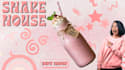
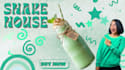
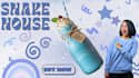
When designing this campaign concept for The Shake House, my main goal was to create an instant sensory connection the second someone scrolls past the graphic.
Here is a look behind the design process:
Monochromatic Coding: To give each shake flavor its own distinct personality, I used a strict monochromatic color scheme. By matching the typography, playful background doodles, and even the model's wardrobe to the flavor of the product (Strawberry, Mint, and Blue Velvet), the visual loop feels incredibly cohesive and satisfying.
️ Directional Cueing: Using a human element with an energetic, expressive gesture isn't just for funits a visual hierarchy trick. The model's pointing gesture naturally directs the viewers eyes straight to the hero product and the "Buy Now" call-to-action.
Playful vs. Structured: Balancing retro, fluid typography with energetic background shapes helps capture that fun, indulgent, weekend-treat feeling that a great milkshake represents.
As a designer, I love exploring how color psychology and layout composition can directly influence consumer behavior.
Tell me about your next dream project?
Poster, Banner or something unique let's talk about it.


