Browse categories
Explore
Fiverr Pro
English
$
USD
Electronics Engineer, Python Automation, Data Scripts
Tired of spending hours copying data, formatting cells, and building charts by hand every week or month?
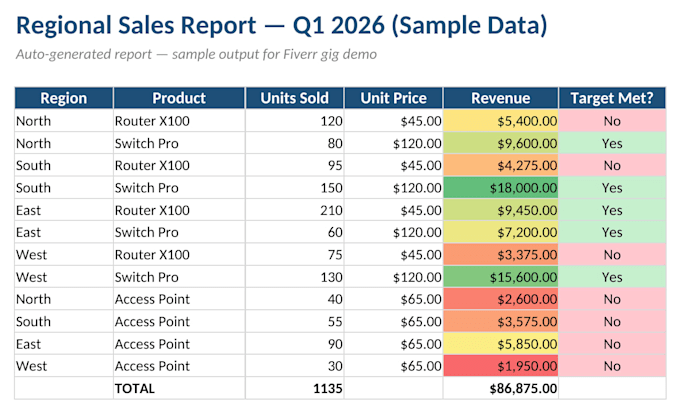
I automate your Excel reporting workflow using Python turning raw, messy data into polished, professional reports with charts, formatted tables, and conditional formatting, automatically.
What I can automate:
Consolidating data from multiple sheets/files into one report
Professional formatting (headers, colors, borders)
Charts generated automatically from your data
Conditional formatting (highlight top performers, flag issues)
Pivot tables and summary dashboards
Reusable scripts to re-run the same report every month
Tools: Python (pandas, openpyxl, xlsxwriter), Excel VBA when needed.
Ideal for business owners and analysts who need raw data turned into a client-ready report, without redoing the work manually each time.
I'm a telecommunications engineer with a strong background in data validation and process automation for technical reporting accuracy matters as much as presentation.
Send me a sample of your data and what you need, and I'll confirm scope before we start.


Technology:
Excel
•
Python
•
VBA
What file formats do you accept as input?
CSV, XLSX, or XLS. If your data comes from a database or another source, tell me and we'll figure out the best way to connect it.
Q: Will I be able to reuse the report with new data later?
A: Yes, with the Standard and Premium packages I deliver a script you can re-run whenever your data updates. For the Premium tier I can also deliver a ready-to-use Excel file with macros.
Q: Do you need my real/full dataset to start?
A: No — a sample with the same structure (column names, a few sample rows) is enough for me to build and test everything before you send the real file.