Browse categories
Explore
Fiverr Pro
English
$
USD




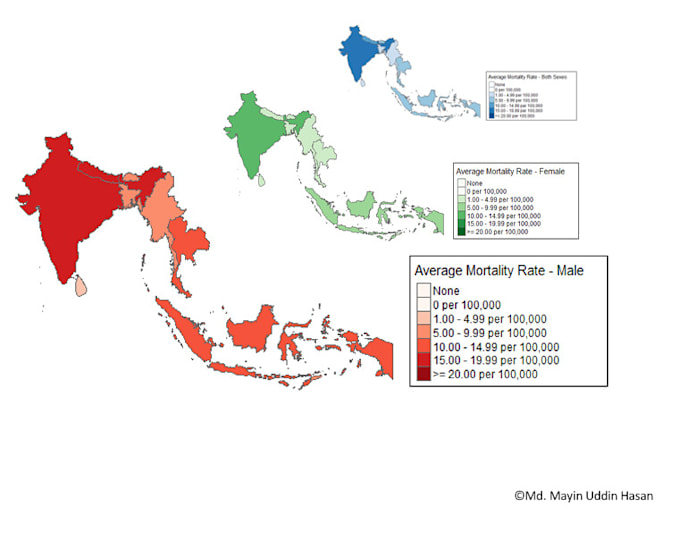
I create clear, professional data visualizations tailored to your medical or research data. From bar, pie, line, scatter, and boxplots to advanced and interactive global or local maps, I bring your data to life for reports, publications, or presentations. Using tools like R, Python, STATA and SPSS, I deliver high-quality visuals that make your results easy to understand and impactful. Fast delivery and revisions included!
Languages
What types of charts and plots do you create?
I create bar, pie, line, scatter, boxplots, advanced statistical plots, and interactive maps (global and local).
What data formats do you accept?
I work with Excel, CSV, SPSS, R, Python files, and more.
Can you customize visuals to match my publication or presentation style?
Yes! I tailor colors, fonts, and layouts to meet your specific requirements.