Browse categories
Explore
Fiverr Pro
English
$
USD


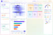


AI Data Visualization with Python & Power BI Interactive Dashboards & Graphs
Are you struggling to turn raw data into clear, actionable insights? I will create professional, AI-powered data visualization dashboards using Python and Power BI, tailored to your business, research, or thesis needs.
I deliver dashboards and reports that are:
- Professional & Clean: Easy-to-understand visuals that highlight key insights
- Interactive & Engaging: Hover, filters, and dynamic charts for full interactivity
- AI-Powered: Use Python for advanced analysis, predictive insights, and custom visualizations
- Fast & Reliable: Delivered on time with revisions to ensure your satisfaction
What I Offer:
Data Cleaning & Preparation Transform messy datasets into usable format
Interactive Dashboards Combine charts, graphs, and tables into a single view
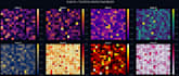
Charts & Graphs Bar, Line, Pie, Scatter, Heatmap, Tree Map, and more
Web Embedding (Optional) Share your dashboards online with clients or team
Advanced Analysis & Insights Correlations, predictions, and AI-driven insights
Perfect For:
- Businesses needing reports & KPI dashboards
- Students creating research or thesis
I will clean and analyze your Excel data professionally
Languages
What types of data can you work with?
I can work with Excel, CSV, JSON, SQL databases, Google Sheets, and most structured datasets. If your format is unusual, please contact me first.
Can you create interactive dashboards?
Yes! I provide interactive dashboards with hover, filters, and dynamic charts using Power BI or Python (Plotly / Matplotlib).
Can you connect the dashboard to live data sources?
Absolutely! For Premium plans, I can connect your dashboard to live Excel files, Google Sheets, or SQL databases so it updates automatically.
How many charts/graphs do you include?
Basic: 2 charts Standard: 5 charts Premium: 10 charts You can also add extra charts via Gig Extras.
Can you create dashboards for research or thesis projects?
Yes! I specialize in creating professional, easy-to-understand visualizations for students, researchers, and academic reports.
What tools do you use?
I use Python (Matplotlib, Seaborn, Plotly), Microsoft Power BI, Excel, and AI tools to clean and visualize data quickly.
Can you deliver the project faster?
Yes! You can select the Fast Delivery Gig Extra to get your dashboard in half the standard delivery time.
Can I request revisions if I’m not satisfied?
Yes! Each plan includes 1–3 revisions, and you can also purchase extra revisions via Gig Extras if needed.
Q9: What formats will you deliver the dashboard in?
Dashboards can be delivered as PDF, PowerPoint, Image files, or interactive HTML dashboards (if included in the Premium plan or Extras).