Browse categories
English
$
USD
Connect to your AI


WAIT! Imagine an elite corporate client viewing your storefront on a high-end display, only to bounce instantly because your design looks warped.
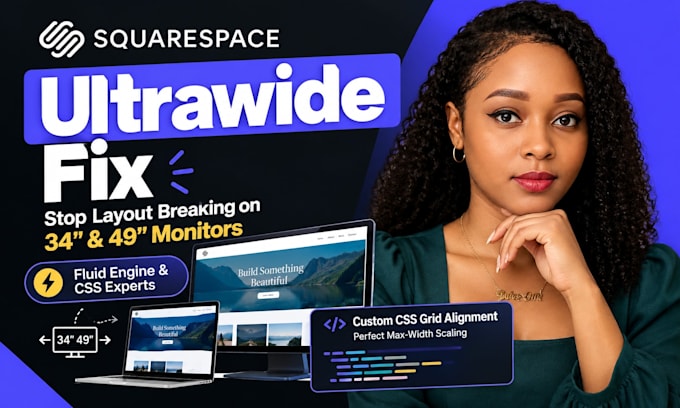
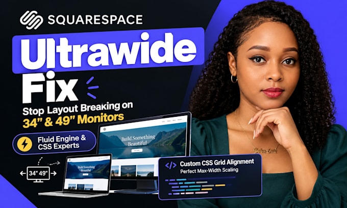
Your Squarespace site layout breaks ultrawide monitors because default Fluid Engine rules allow containers to stretch without restriction. On 34 or 49-inch screens, pages collapse into layout bugs: overlapping text, huge empty spaces, and grid shifts that destroy your brand authority.
I fix this layout distortion by injecting clean custom CSS code. By targeting block IDs and adding precise max-width rules, I ensure your design remains stable, centered, and flawless across wide monitors.
What you receive:
Why choose me:
I focus on technical precision and premium user experiences. I write native layout codes that respect your branding without bloated plugins. You get clear updates and total layout stability.
Protect your brand. Message me with your URL to audit your layout structure. Let's solve this now.
Please inform the freelancer of any preferences or concerns regarding the use of AI tools in the completion and/or delivery of your order.
Please be aware that it is against Fiverr's policies for sellers to include themes, templates, or any other elements that infringe third-party rights or applicable laws in the delivered work. Read more about in our Guide to Responsible Digital Creation.
Squarespace Website Repair Specialist
Languages
Why does my Squarespace site look perfect on a laptop but completely broken on my ultrawide monitor?
Standard Squarespace Fluid Engine frameworks use flexible percentage-based grids. Without hardcoded max-width CSS limits, your text boxes and image grids stretch infinitely to fill massive widescreen resolutions, causing text overlaps and chaotic layouts.
Will adding this custom CSS code slow down my page loading speeds or affect my SEO?
Not at all. I write clean, minified, native CSS styling overrides that inject directly into your site settings. This takes microseconds to parse, keeping your core web vitals healthy and preserving your search engine rankings.
Do you need my master Squarespace account login credentials to implement the fix?
No, you never have to share your primary passwords. You can easily invite me as a temporary "Contributor" with site editor permissions via your dashboard. This fully protects your sensitive billing and account data.
Will your widescreen layout patches break when I add new content or sections in the future?
The global responsive layout rules I write are structured to adapt to future updates. However, if you build a brand new page with highly complex custom grid blocks, you may occasionally need minor targeted CSS modifications.
Can you fix layout scaling issues for specific third-party embedded apps or forms?
Yes. If external elements like custom HubSpot forms, Calendly schedulers, or video players stretch awkwardly on wide monitors, I isolate their specific container block IDs to enforce responsive alignment rules
What happens if an automated Squarespace platform system update breaks your custom code?
I utilize highly specific CSS selectors that target your permanent layout structure rather than temporary platform classes. This ensures your custom layout code remains safe and operational during system framework rollouts.
Does this gig cover fixing responsive layout issues for mobile viewports and tablets too?
My primary focus here is solving widescreen and ultrawide monitor stretching. However, my custom code ensures total multi-device safety, ensuring your desktop fixes never conflict with your mobile scaling layers