Uber Performance Analytics Dashboard Overview
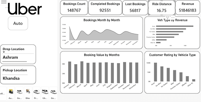
This Power BI dashboard visualises operational ride metrics, vehicle category performance, and seasonal trends across select routes.
Key Summary Metrics (KPI Cards)
- Bookings Count: 1,48,767 total booking requests initiated.
- Completed Bookings: 92,551 successful trips (~62.2% completion rate).
- Lost Bookings: 56,817 unfulfilled trips (cancellations or no-shows, representing ~38.2%).
- Ride Distance: 16.75 km average trip length.
- Revenue: 5,18,46,183 (approx. 5.18 Crore) generated overall.
Filters & Slicers
- Drop Location: Ashram
- Pickup Location: Khandsa
- Selected Vehicle Category: Auto (with additional slicer icons visible for e-Bike, Go Mini, Bike, Premier Sedan, and Uber XL).
Core Visualisations
- Bookings Month by Month (Area Chart):
- Displays volume trends across the year.
- Starts strong in January (~13,200), drops sharply to an annual low in February (< 11,500), and rebounds through March, July, and October to average around 12,500 bookings monthly.
- Booking Value by Months (Column Chart):
- Highlights revenue distribution from January to December.
- Shows consistent monthly booking values averaging between 4M to 4.5M (4045 Lakhs), with January,