I will improve your power bi dashboard UI UX

P
petersenpedro
P
petersenpedro
Pedro P

About this gig

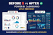
Is your Power BI dashboard confusing, outdated, or hard to use?

I will redesign and improve your dashboard to make it clean, modern, and user-friendly while also improving performance.

️ Each dashboard refers to one Power BI report page (.pbix).

Multiple pages can be discussed and quoted separately.

What I improve:

  • Dashboard layout and structure (per page)
  • Visual design (colors, typography, spacing)
  • User experience (navigation, filters, usability)
  • Performance issues (slow visuals, heavy models)
  • Clarity and storytelling with data

What I will do:

  • Analyze your current dashboard
  • Redesign each page using best practices
  • Simplify and improve visuals
  • Optimize performance where needed

Results you can expect:

  • Modern and professional dashboards
  • Better user experience
  • Faster and more efficient reports
  • Clear and actionable insights

I combine design + data engineering to deliver dashboards people actually use.

If your dashboard looks outdated or is hard to understand I can transform it.

Contact me before ordering to review your current report and number of pages.

Get to know Pedro P

Pedro P

Data Analyst

  • FromBrazil
  • Member sinceApr 2026
  • Avg. response time1 hour
  • Languages

    English
I work in the Data field with experience in analysis, modeling, and visualization using tools such as Power BI. I’m specializing in Data Engineering, focusing on modern architectures and scalable solutions that support large volumes of information.