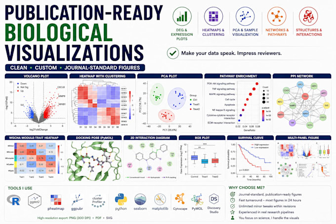
I create clean, publication-ready biological data visualizations that are journal-submission standard and fully customized to your data.
I offer:
- Volcano Plots: DEG visualization with labeled significant genes, custom color schemes and significance thresholds
- Heatmaps: Gene expression, correlation matrices, sample clustering with dendrograms
- PCA Plots: Sample grouping, variance explained, batch effect visualization
- Pathway Enrichment Plots: GO/KEGG dot plots, bar plots, bubble charts
- Network Graphs: PPI networks, co-expression networks, drug-target interaction maps in Cytoscape
- WGCNA Plots: Module-trait correlation heatmaps, eigengene plots, dendrogram with color bars
- Docking & Structure Figures: PyMOL binding pose renders, 2D interaction diagrams in Discovery Studio
- Box/Violin/Bar Plots: Gene expression comparisons, group statistics, clinical data summaries
- Survival Curves: Kaplan-Meier plots with p-values and confidence intervals
Tools I use:
- R ggplot2, pheatmap, ggpubr, survminer, clusterProfiler
- Python matplotlib, seaborn, plotly
Why choose me:
Every figure I make follows real journal submission standards
Actively preparing manuscript figures for peer-reviewed publications