Browse categories
Explore
Fiverr Pro
English
$
USD
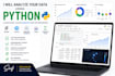
I will dig into your dataset using Python and deliver clean, professional charts
that make your findings easy to understand.
Tools I use:
pandas data loading, cleaning, and transformation
NumPy numerical analysis
Matplotlib & Seaborn static professional charts
Plotly interactive, shareable charts
Statistical tests: ANOVA, Spearman correlation, IQR outlier detection
What you will receive:
A clean Jupyter Notebook with all code and explanations
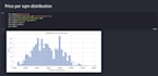
Professional charts exported as PNG/HTML
Written narrative for each chart explaining what it means
Outlier detection and data quality summary
Key findings and conclusions
Recent work:
Scraped + analyzed 447 real estate listings from PropertyFinder.eg
Used ANOVA (F=68.56, p<0.001) to prove neighborhood is the main pricing driver
Delivered 10+ static and interactive charts including a live geographic map
Send your data as CSV, Excel, or share a link.
Message me first if your request involves web scraping I am happy to help.


Expertise:
Business Insights
•
Trends
•
Statistics
Technology:
Jupyter Notebook
Programming language:
Python
Do you do machine learning or predictive modeling?
Not yet, my focus is data analysis, EDA, and visualization. If you need regression or forecasting, message me and we can discuss.
Can I request specific chart types?
Absolutely. Tell me exactly what you want and I will build it.
What format will the deliverables be in?
A .ipynb Jupyter Notebook + PNG chart exports. PDF report available in the premium package or as an add-on.


