Browse categories
Explore
Fiverr Pro
English
$
USD

YOUR DATA IS ONLY AS POWERFUL AS HOW IT LOOKS.
Numbers in a spreadsheet convince no one.
A clean, professional chart convinces everyone.
I'll turn your raw data into visualizations that
communicate instantly for presentations, reports,
thesis, or business pitches.
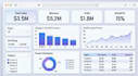
CHART TYPES I CREATE
Bar charts, line graphs, pie charts
Scatter plots and bubble charts
Heatmaps and correlation matrices
Box plots and distribution charts
Time series and trend lines
Power BI dashboards (Premium)
TOOLS
Python | Matplotlib | Seaborn | Plotly | Power BI
PERFECT FOR
Students who need clean thesis charts
Founders building pitch decks
Marketing teams tracking campaign data
Researchers presenting survey findings
Business owners tracking sales trends
WHAT YOU'LL RECEIVE
High-resolution PNG charts (300 DPI)
Custom colors to match your brand
One-line insight caption per chart
Python source code (Standard & Premium)
PDF export (Standard & Premium)
SEND ME YOUR DATA BEFORE ORDERING I'll tell
you exactly which charts will tell your story best.
Let's make your data impossible to ignore.
Data Analyst , Python , EDA , Visualization, Actionable Insights
Languages
What format will I receive the charts in?
High-resolution PNG (300 DPI) — ready for presentations and print. PDF on request.
Can you match my brand colors?
Yes — share your hex codes or tell me the colors and I'll match them exactly
I don't have Python — can I edit the charts later?
I can deliver as editable Excel charts or provide the Python code with simple instructions.
Can you add my company logo to the charts?
Yes, included at no extra cost
What if I need more charts than the package offers?
Message me and I'll create a custom offer.


